


Major updates to Chinilla!

After launching Chinilla, I realized something:
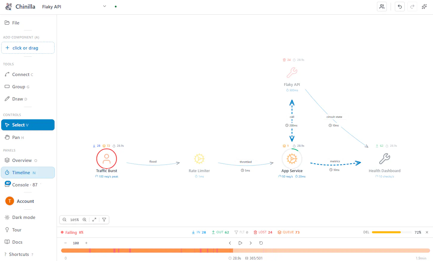
People understood the idea but they weren’t feeling what their system was doing.
So I focused on one thing:
making system behavior obvious at a glance
1. New visual simulation UX + new sidebar
We redesigned the simulation to make every request visible:
🟢 delivered → quick green flash
🔴 lost → red flash
🟣 filtered → purple
🟠 queues fill → orange flash when bottlenecking
Instead of reading logs or guessing, you can just watch the system behave.
2. Live team collaboration
You can now design and debug systems together:
share a link or invite by email
see live cursors
step through simulations in real time
3. New landing + dashboard
We also rebuilt the landing and dashboard to better reflect how the product actually works.
Cleaner UX, clearer feedback, and faster to understand what’s going on.

Where this is heading
The direction is becoming clearer:
design systems → simulate behavior → fix what breaks
This update was mainly about making the product feel right and less like a diagram tool, more like something you can actually use to understand systems.
Check out the new updates @ chinilla.com
Would love any feedback 🙏!!
Replies