Smartlytics 📊 is an interactive Power BI dashboard designed to turn raw smartphone sales data into meaningful, actionable insights. It helps you explore how different smartphone brands perform across regions and customer segments — all through clean, intuitive visualizations. Whether you're a data enthusiast, analyst, or someone building a portfolio project, this dashboard makes it easy to uncover trends, compare performance, and make data-driven decisions.
Hey everyone 👋
I’m excited to launch Smartlytics 📊— a Smartphone Sales Analytics Dashboard built using Power BI.
This project started as a way to go beyond basic charts and actually explore how sales data can tell a story. I wanted to create something that not only looks good but also helps answer real business questions.
With this dashboard, you can:
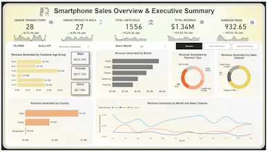
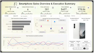
• Track key KPIs like revenue, transactions, and average price
• Compare smartphone brand performance
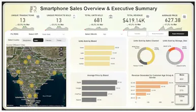
• Analyze regional sales trends
• Understand customer demographics
Everything is fully interactive, so you can slice and explore the data however you want.
I built this using Power BI, Power Query, and DAX, working with an Excel dataset to simulate real-world analysis.
I’d really appreciate your feedback — especially on:
👉 Dashboard design & usability
👉 Insights and storytelling
👉 What you’d improve or add
If you find it useful, feel free to support and share 🙌
Thanks for checking it out!


TrackFit