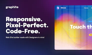
Graphite Space is a free online website builder carefully crafted with web designers’ best interests in mind. Use familiar graphic editor tools to create professional grade web pages and publish them online without working with HTML, CSS or JavaScript code.
Thanks a million🎉 I'm very glad to hear appreciation, especially in a design field 🙂
Report
Looks awesome so far! The ability to freely design at different screen sizes look amazing. It is truly a designer's tool from what I am seeing. I look forward to playing with this in the next few days! Congrats
@aryaaagarwal Thank you for your support and appreciation! 🙏
Report
Great product, it looks quite easy to use, which is pretty cool when you're intimidated by code. I'm just wondering how it will fight against competitors like Wix
@rubenwolff Hey Ruben! Thank you so much for your comment, I'm glad you like our product. As for 'fighting against competitors' – we actually appreciate the competition and diversity this market has to offer. Wix, for one, has done a lot of good for the industry, so it would be a shame to 'fight' them 😄
That is a valid concern, however, and I put my faith in the fact that, compared to the competition, Graphite emphasizes visual editing, comfort and design consistency. So if you're a designer, chances are you'll like Graphite better than any other tool out there. At least that's what we're counting on 🙂
Honestly, I'm gonna try this. I think that if Webflow and Figma had a baby, it would be Graphite. Looks even easier to use and export a fully designed website.
@damien_bradshaw Thank you for showing interest in giving Graphite a try, looking forward to hearing your feedback! 🙌
Can't help but appreciate you nailing the essential concept of our product – your definition of Graphite has made the team's day. We're already ordering t-shirts with that line on them 😄
@followsummer I'm already making a difference in a startup's life. You better send me one. I'd proudly wear that lol
Report
Hey Graphite Team, thanks for giving the community the opportunity to try this product at such a stage! At first glance I was surprised, as I was excpecting to see more, but after playing the interface for a while I figured out that there's actually quite some stuff under the hood. Few things I want to mention before giving macro impression:
1. The fact that I have to click the settings icon or pick which pannel to open in order to change things is nice, but I do think that making the right panel visible all the time/only once selecting an element/toggle to decide, would be helpful so that the user won't have to re-open it when selecting different elements.
2. I'm also missing the option to just add a navigation bar instead of building one from scarch. the alignment of the buttons was not intuitive for me.
3. Speaking of buttons, changing the color was kinda hard to find (maybe because I had to change the panel from the former element). I did get the idea of keeping the colors constant/design system/components, but I had to search for it and the colors panel is not clear enough what is what, for me. I also couldn't find where I decide on the button state.
Putting these little things aside - It looks very neat, clean, modern, keeping up with the technologies and promising. Your roadmap looks very intersting and even exciting (headless CMS!) but at the moment it feels like it is not 'baked' enough to pick it as a website builder for anything complex - maybe for simple landing pages or so. BUT just for the record, I played it only around 20 minutes so i'm sure it can do a lot more than that!
The code and preformances looks good, and I would be happy to check it up again in the future to see how it evolves. Wishing you a lot fun on the way and looking forward!!
@rotem_abir Many thanks for such a thorough comment! That's exactly the feedback we're hoping for, and it will no doubt have a massive positive impact on the product – I mean it, we're taking these suggestions into one of our next sprints 🙂
1. This comment is spot on. Opening the panel every time is annoying indeed – it's more of an old architecture legacy that needs to be fixed.
2. So true. Almost every web site has a menu, so it's only fair that we add a new 'menu' element that users expect to see.
3. Also true. The current method we have for changing the color of a button is... unconventional 😄 This functionality can be found in the 'Variant' settings, which I agree is not an obvious place to look for it. We plan on relocating color settings to the overall settings tab in the near future.
We also have great plans for expanding our functionality to help our users design genuinely sophisticated web sites. Thank you so much for your kind words and wishes!




Graphite
Graphite
Graphite
Graphite
Graphite
Graphite
Graphite
Graphite
Graphite
PingBell
Graphite
PingBell
Graphite