

Heywa
Tappable visual stories instead of ChatGPT text walls
436 followers
Tappable visual stories instead of ChatGPT text walls
436 followers
From prompt to visual story in seconds. Heywa dynamically builds the right visual experience around your question, so you can browse, compare, and go deeper - without endless tabs or long chat responses.


Heywa
Hey Product Hunt 👋
I’m Milena, founder of Heywa Labs. I’ve wanted to launch this for a long time, and it's a bit surreal to finally share it here.
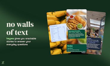
The origin story is simple: finding answers online is kind of boring. We spend hours a day in beautifully designed, intuitive mobile apps. They’re visual, responsive, easy to move through. And then the moment we want to learn, decide or scratch the curiosity itch, we’re back to either a list of blue links or a wall of chatbot text. It feels outdated.
Heywa is our attempt to make answering a question feel more like using a great app. You ask something - what to cook tonight, is HIIT actually good for you, what is solipsism - and instead of links or a long essay, you get a visual, structured story you can tap through. It helps you refine, it suggests follow-up actions, it lets you choose if you want to rabbit-hole or decide fast.
We're built for everyday questions. The small stuff. The random curiosity at 11pm. The decision you've been putting off. The idea that's been rattling around in your head.
Under the hood, it’s powered by what we call Generative UX. Not just generated content - the interface itself reshapes around your intent. A travel question looks different from a health question. A comparison behaves differently from open exploration. At Heywa Labs, we think this is where AI products are heading: interfaces that adapt to what you’re trying to do, not static boxes with smarter text inside.
We’re early and very open to feedback. Please drop a question below - Heywa and I are around all day to answer 👇
Milena 💚
Love this@milena_nikolic2! Someone had to change the current standard. Most humans have visual minds, the current interfaces of the big providers seem backwards thinking! Good luck!
Heywa
@sean_king5 thanks, really appreciate that! That was exactly the motivation behind Heywa. We spend most of our spare time in beautifully designed apps, but the moment we need an answer or to get things done online we’re back to blue links or walls of text. Hoping heywa makes this more delightful for all the visual minds out there!!
@milena_nikolic2 I am so visual, I cannot handle the walls of text. This is a wonderful product, excited for your launch!
Jupid
Congrats on the launch, Milena! The "Generative UX" framing is really compelling — the interface reshaping around intent rather than just generating smarter text feels like the right direction. Quick question: for SEO/content discovery use cases (e.g. "best cafes in Lisbon"), are you indexing your own crawled content or pulling from existing search APIs? Curious how fresh/accurate local results are vs something like Perplexity.
Heywa
@ilya_lee great question, so glad you asked! We have numerous tool integrations, and place info providers is one/two of them (think Tripadvisor API and similar, so that's pretty fresh). Signals on which places are best then also come from web search index call, as well as LLM itself, quotes come from Reddit API tool - and our orchestrator takes all that into account when it chooses what to feature.
Any feedback on what else would be useful here - let us know!
Heywa
Hi @ilya_lee thank you for your support.
You can also read more about our take on Gen UX at Generativeux.com.
The 'without endless tabs' angle is what resonates most the current workflow of researching anything complex is genuinely broken. You open 12 tabs, lose track of which one had the thing you needed, and end up with a flat chat response that doesn't help you see relationships between ideas. Curious what types of questions this works best for right now is it more effective for factual research and comparisons or does it also handle more abstract exploratory questions where the structure isn't obvious upfront? That second category is where I'd imagine the visual layout gets really interesting but also really hard to get right.
Heywa
@zerodarkhub I sorely feel that Elvis! We're exploring and learning about this as much as you or anyone else is.
Rather than thinking in terms of categories like the ones you suggested, I personally think we see the best results with questions where you start with quite a broad ask, where there's lots of different possible answers that can all be quite visual (like, 'what should I do in a weekend in Brussels') and can then tailor in to a set of more concrete requirements once you've seen that initial suggestion (ie. 'I am vegan and I quite like stationary shops').
These answers give you the feeling of browsing a pinterest board or article, but then being able to dissect it and go deep on anything that takes your fancy (which really feels like the super power with our product).
Hope this answers your question :)
The "generative UX" framing is interesting. The observation that a travel question should look different from a health question is something most AI interfaces completely ignore. Everything gets the same text-wall treatment regardless of what you're actually trying to do.
How do you handle questions where the best answer is "it depends on your situation"? Health questions especially tend to have answers that vary a lot by individual context. Does the visual format make it easier or harder to show that kind of nuance?
Heywa
@whatworkedforme good question!
In simplest terms, I think these kind of problems exist regardless of how your UI looks or works - wall of text, story or otherwise. Sometimes the user desires a certain style or approach to their answer (i.e. 'talk like a pirate'), whereas sometimes the answer 'desires' a certain style to get across to the user (i.e. 'this data is best displayed as a graph)
Getting back from the abstract to reality, though, at some point we need to make a decision about 'show this versus that'. Right now we take a stance of getting something in front of the user in a manner we think works best, and let them give us feedback to tailor the answer to their needs. We recognise that we're not likely ever to be 100% perfect, so the answer needs to be able to be moulded and shaped to what the user wants (i.e. use celcius instead of farenheit), without regenerating the whole thing.
The medium-long term view is to take in to account existing user context and preferences (ie. this person prefers wordier, longer answers and more jargon, or this person responds better to diagrams, or this person uses celcius for temperature) to tailor the response as best as possible.
Hope that gets at what you're pondering!
Told
The core insight here is sharp — most AI interfaces optimize for generating answers, not for how humans actually process information. Tappable stories that let you browse and compare could meaningfully reduce cognitive load, especially for research-heavy queries. Curious how you're handling depth vs. brevity trade-offs: when a topic genuinely requires nuance, does the story format ever feel like it's flattening the answer? Would love to see how retention and 'go deeper' click rates compare to traditional chat interfaces once you have early data.
Heywa
@jscanzi Great callout, and definitely a tension with any search. Before you get enough context on how deep a users wants their answers to go, you have to cut a line somewhere. The story format definitely biases towards certain kinds of answers, where they can be structured in to individual talking points or 'story beats'. I do think there are some answers where a text article will end up being the predominant answer (but I hope they can look and read better than what is out there today).
In the future we'd love to have a system that can deploy a wide range of possible formats (text, story, video?) to answer a question in a way that best suits the user and best suits the answer. That said, we decided to start with story format as a constrained canvas where we can refine and nail down what makes a good answer before expanding to other formats.
Told
@davepaliwoda Thanks a lot for your reply!
Trufflow
This feels like a really unique way to do research or for studying. Are there ways to configure what sources the answers come from? For instance, if I don't want to see any TikTok videos so that I don't get distracted, is there a setting for that?
Heywa
@lienchueh thanks, glad you like it! We haven't built that support yet, but I understand individual preferences, especially wrt sources matter. We had another early user who expressed the wish to see more Reddit quotes - and earlier in the story flow. We will look into ways to express individual source or flow preferences like this!
Heywa
Super excited to be part of this launch!
Heywa is super interesting and challenging to work on. One of the most interesting technical challenges was orchestrating all the different sources together into a engaging, truthful answer.
A single user query gets decomposed into many parallel sub-queries across multiple retrieval sources, MCP tool integrations, and image sources, then the results get synthesised back into a coherent, enriched answer with relevant images. Not easy to do!
Getting all of that to stream back to the user in real-time while an LLM planner dynamically decides which tools and sources to invoke was a genuinely hard problem. Really excited to finally share what we've been building!