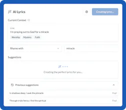
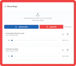
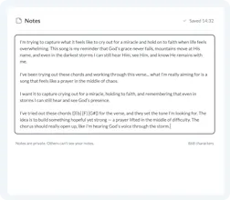
Lyrica is a collaborative songwriting workspace built for ideas in progress. It gives you a place to drop rough lines, explore rewrites, test new verses, invite collaborators, and shape songs without pressure. Use AI when you’re stuck, notes when you’re thinking, and comments when you’re collaborating. Nothing is overwritten. Nothing is forced. Lyrica keeps everything in one focused space so you can stay with a song long enough to finish it.
No reviews yetBe the first to leave a review for Lyrica
Maker
📌
Lyrica came from years of starting songs and not finishing them.
Most tools either feel too empty (just a notes app) or too pushy (generate everything for you). What I wanted didn’t exist: a workspace where unfinished songs could live without pressure.
Lyrica is designed to sit with a song over time. You can drop in rough lines, explore rewrites, leave notes, collaborate, and use AI only when you’re genuinely stuck — without overwriting your voice or losing earlier ideas.
The goal isn’t speed. It’s momentum.
Excited to finally share this, and keen to hear how others here deal with getting stuck mid-song 🙏
Report
💡 Bright idea
@loganransley Congrats on the launch! 🚀 I’ve been exploring the product and I really like the direction you’re taking.
While navigating the 'My Song' page, I noticed two small UI/UX opportunities to make the experience even smoother:
Overlay Transparency: When opening the settings via the gear icon, the background overlay is a bit too dark. It makes it difficult to see the real-time changes happening to the cards underneath. Tweak the opacity slightly would give users much better visual feedback.
UI Consistency: In the three-dot dropdown menu on the song cards, the 'Rename' action is the only one without an icon. Adding a simple pencil icon would fix this tiny inconsistency and make the menu feel more polished and professional.
Details matter, and you guys are off to a great start! Hope this helps with the post-launch polish. The product is solid, already upvoted!
Report
Maker
@giorgio_cignitti_phd Awesome thank you so much for those suggestions. I will get that fixed asap.


@loganransley
Congrats on the launch! 🚀 I’ve been exploring the product and I really like the direction you’re taking.
While navigating the 'My Song' page, I noticed two small UI/UX opportunities to make the experience even smoother:
Overlay Transparency: When opening the settings via the gear icon, the background overlay is a bit too dark. It makes it difficult to see the real-time changes happening to the cards underneath. Tweak the opacity slightly would give users much better visual feedback.
UI Consistency: In the three-dot dropdown menu on the song cards, the 'Rename' action is the only one without an icon. Adding a simple pencil icon would fix this tiny inconsistency and make the menu feel more polished and professional.
Details matter, and you guys are off to a great start! Hope this helps with the post-launch polish. The product is solid, already upvoted!
@giorgio_cignitti_phd Awesome thank you so much for those suggestions. I will get that fixed asap.