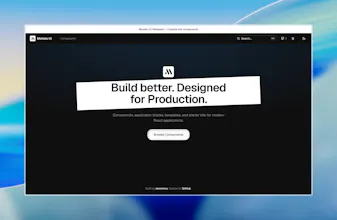
Everything you need to build modern React applications. Components, docs, a Motoko UI is an open-source collection of polished React components, blocks, and patterns for modern apps. Built on the shadcn/ui model — you copy the code, own every line, and customize without fighting a black-box library. Every component is crafted with intentional spacing, typography, motion, and accessibility (Radix UI). Works with React, Next.js, Tailwind CSS, and TypeScript.
No reviews yetBe the first to leave a review for Motoko UI
Maker
📌
Hey Product Hunt! 👋
I’m Vlad, creator of Motoko UI.
After years of using UI libraries, I kept hitting the same wall: everything worked, but nothing felt designed. shadcn/ui changed the game by letting developers own their code — Motoko builds on that idea with a stronger focus on visual identity, motion, and the small details most people never notice but always feel.
What you’ll find today:
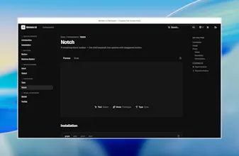
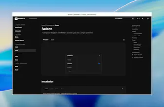
A growing set of components (Button, Rainbow Button, Input, Select, Tabs, Notch, Modal, Tooltip)
Full docs with live previews at motokoui.com
One-command install via the shadcn CLI
This is v0.1 — early, but real. I’d love your feedback:
Which components should come next?
What’s missing from the docs?
Does the design direction resonate with you?
Thank you for checking it out. Details make perfection — and I hope Motoko helps you ship something people genuinely enjoy using. 🙏
Report
The shadcn-style ownership model is what drew me in, and the Radix accessibility foundation is solid. One thing I'd love to see is a dedicated dark mode toggle component with system preference detection baked in, since right now I have to wire that up myself every time. Would save a chunk of setup work across projects.
Report
Nice positioning. Curious—what's the principle behind deciding which components belong in Motoko and which don't? That seems like a surprisingly strategic product decision.




The shadcn-style ownership model is what drew me in, and the Radix accessibility foundation is solid. One thing I'd love to see is a dedicated dark mode toggle component with system preference detection baked in, since right now I have to wire that up myself every time. Would save a chunk of setup work across projects.
Nice positioning. Curious—what's the principle behind deciding which components belong in Motoko and which don't? That seems like a surprisingly strategic product decision.