
Launching today

NotebookLM Custom Infographic Styles
Turn any source into a styled infographic
97 followers
Turn any source into a styled infographic
97 followers
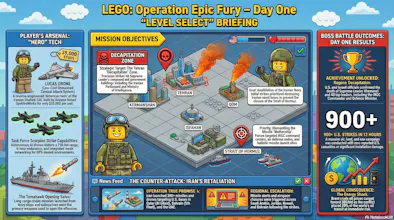
You've been copy-pasting AI summaries into Canva for too long. NotebookLM's Custom Infographic Styles turns your sources directly into polished visuals. 10 presets plus a custom mode. Sketch, anime, editorial, bricks, and more. Research-to-visual in seconds.


Visual communication has always been the bottleneck nobody talks about.
You do the research. You synthesize it with AI. Then you paste it into Canva, fight with layouts, pick fonts, give up, and ship something mediocre. The insight was great. The visual killed it. 😮💨
NotebookLM just quietly patched that gap. 🔧
Custom Infographic Styles gives you 10 visual presets plus a fully custom mode to transform any source material into a publication-ready infographic. One click. Source-grounded, not hallucinated. ✅
The styles are genuinely varied:
🌸 Kawaii for approachable, shareable content
📰 Editorial for thought leadership pieces
🗂️ Bento grid for modular, social-first layouts
🧊 3D clay for visual pop without the Blender learning curve
✏️ Sketch, anime, storyboard, bricks, professional rounding out the rest
The deeper unlock here is the custom mode. 🎨
You describe the aesthetic you want and NotebookLM builds around it. Color codes, tone, layout philosophy. This is where brand consistency starts becoming possible inside a research tool.
Who this is for right now:
🔬 Researchers who need to make dense material accessible
🏫 Educators turning syllabi or notes into visual explainers
🚀 Founders building decks or one-pagers from raw research
📣 Content teams who live in NotebookLM and hate the Canva commute
The honest limitation: you can't manually drag or edit elements. It's prompt-driven. If you need pixel-perfect control, you still go to Figma. But for "good enough to publish in 30 seconds," this clears that bar easily.
The trajectory here is what I find most interesting.
NotebookLM started as a research tool. Then it added audio overviews, slide decks, mind maps. Now styled infographics. It's quietly becoming a full production layer on top of your knowledge. The gap between "understanding something" and "communicating it visually" is collapsing.
Curious what use cases people here are most excited about. Are you using this for personal knowledge work, team communication, or client-facing outputs? 💬