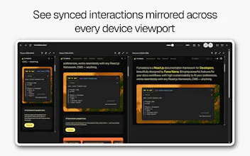
Responsive Simulator is a responsive web design checker and multi device viewport tester for developers, designers, and QA teams. View your website on mobile, tablet, and desktop viewports side by side, so you can test layouts faster without constantly resizing your browser.
No reviews yetBe the first to leave a review for Responsive Simulator
Maker
📌
Hey PH🙌, I built Responsive Simulator because I kept jumping between DevTools, browser resizing, and multiple windows just to check simple responsive issues.
It lets you open any page and preview it across mobile, tablet, and desktop viewports side by side. You can sync scroll, add custom sizes, rotate viewports, pin important ones, and save configurations for later.
Would love to hear what you think, especially from frontend devs, designers, and anyone who QA checks websites often.