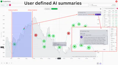
Tradervoice.io visualizes popularity (how widespread) and sentiment (positive/negative) of user generated topics in a line chart. Users can add financial assets historical and current prices to the line chart to look for trends on which they decide to invest.
Link to Tradervoice presentation video:
https://www.youtube.com/watch?v=WjBklO8-5FE&ab_channel=Tradervoice
Interesting concept! I have a question and some feedback:
Question: What other sources of information are you planning to connect in the future? How are you handling the big data amount efficiently in the future?
Feedback: I feel like the UI of the charts with the colored circles decreases the perceived quality of the product. I'd propose the following changes:
1) Color the line of the graph instead of the circles
2) Place the icons without circles, but rather colored in.
These are just a few suggestions but generally speaking, I would recommend you to find a high-class UI quickly, because from a user perspective this is very important (even though it's very unimportant)


Corbado
Crustdata
Scade.pro