
YieldRadar
UK rental yield, mapped by postcode district
5 followers
UK rental yield, mapped by postcode district
5 followers
YieldRadar maps gross rental yield across every UK postcode district, recalculated monthly from live asking prices and rents. Compare any two areas side by side, filter by property type and bedroom count, and run stamp duty, yield, and cashflow numbers on a specific deal. The map, area comparison, budget search, and all three calculators are free. A small paid tier unlocks property-type/bedroom filtering on area pages and a couple of CSV exports.

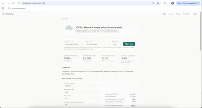


Shipped a few real improvements this week. New: historical month view on the map. Paid users can now pick a past month and see how yield, price, and rent looked at any point in the data's history, not just the latest snapshot, at both postcode area and district level. Filters now update instantly. Every filter on the site, property type, bedrooms, month, used to need a separate click on an "Update" button after you picked an option. Changed that across the whole site so picking a filter applies it immediately, same as a form should feel. Clearer paid vs free labeling. Went through every filter control site-wide and made sure anything paid is actually marked as paid before you try to use it, not just after you hit a paywall. Small thing, but it was inconsistent in a few places. Two new data-driven articles, each with real charts straight from the live dataset: one on the national rental yield trend over the past few months, and a follow-up digging into why that national number doesn't actually hold up once you break it down by price band. Content, not a feature, but worth a mention since it's built entirely from the product's own data.
Being able to overlay commute zones on the map would be huge, since yield alone doesn't help if you're priced out of everywhere reachable from work. Maybe draw isochrones from a postcode or station and let users see average yields within their actual commute range.
@zekiye188365 many thanks for the comment! I was wondering how to implement this and for now decided on having a brief description in the postcode specific pages.
Would you prefer to see it on the map itself (e.g. like a network of trains) or when clicking through onto a specific postcode, the travel links there?
Love how the side-by-side comparison keeps the filters sticky so you can swap postcodes without losing your bedroom or property-type selection, that kind of persistence makes actually running the numbers feel effortless.
@bilalmaras72795 Thanks for the feedback Bilal. I agree, it's hard to find another site that does what YieldRadar attempts to do. Hopefully it will be a useful tool to those who need it