


This is how you compare opinions across countries in real time.

🚀 Road to 1,000,000 #Votap users — Day 71 | Current: 1351
This is how you compare opinions across countries in real time.
Right now I’m working on Votap Premium and trying to bring as much value as possible to early users. This is one of the things I’ve been experimenting with:
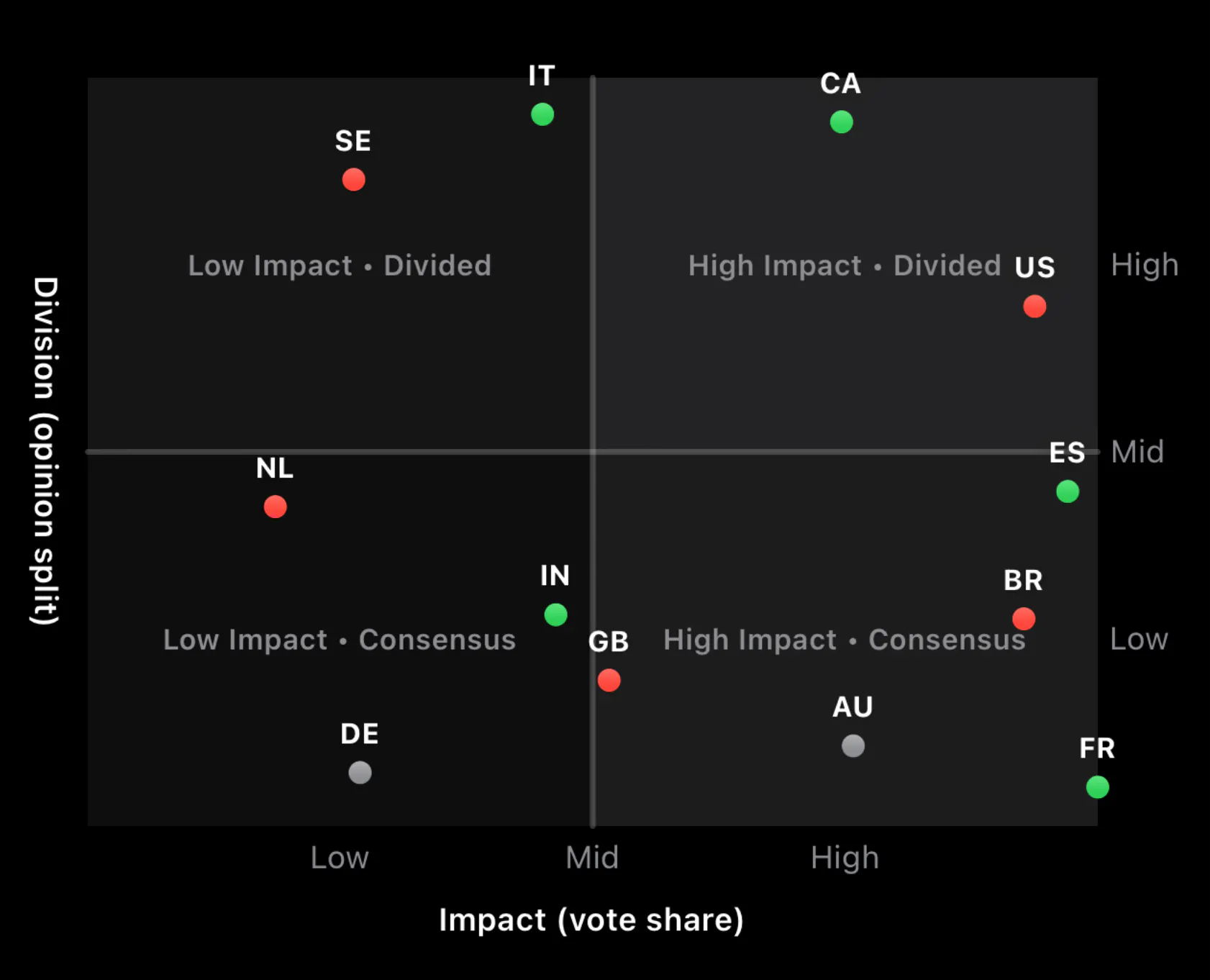
→ X axis (left → right): how many people from each country are voting
More to the right = more votes coming from that country
→ Y axis (bottom → top): how divided people are
Higher = closer to 50/50 (very split opinions)
Lower = more agreement (clear majority)
→ Dot color: what dominates
Green = positive
Red = negative
Grey = neutral
And the best part: it moves in real time as people vote.
Still needs polishing, but it already gives a completely different perspective than just “up vs down”. Curious what you think about this kind of data view.
Download Votap on the App Store if you want to try it out when it's live!
More tomorrow.
Replies